Design elements and their sizes
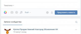
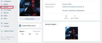
When you have created a public or group, you see an empty template in front of you.
Let's figure out what blocks we need to work on to get an attractive page.
- The photo on the right is the group avatar, which will be shown in messages and notifications to subscribers. The minimum avatar size is 200×200 px, and the maximum is 200×500 px.
- The cover is the banner at the top of the screen. Its dimensions in the full version of VKontakte are 1,590 px in width and 400 px in height, in the mobile application - 1,196 px horizontally and 400 px vertically. Therefore, for correct display on different gadgets, you should not place significant elements on the sides of the cover.
- Information about the public. This section will not contain pictures, but text that will help the visitor understand that this community is interesting to him.
- For business, you definitely need a “Products” section. It is displayed under the main information, the size of each photo is at least 400×400 px, maximum – 1,000×1,000 px. Read the article on how to add products to a group.
- Pictures for posts have a maximum width of 510 px; they can be the same or less in height. The size of the image for the post with the link is 537×240 px. The maximum width of illustrations on wiki pages is 607 px.
- Photo and video albums are also a design element. We have already looked at how to create albums on VKontakte. Here I will only touch on the cover parameters. Its maximum size is 1,200×800 px; the main page displays a reduced format – 200×132 px.
We have decided on the technical parameters. Now let's work on the design of the main sections.
Promotion of the VK community with attachments
Contextual advertising:
The main way of paid promotion of a group is contextual advertising, which exists not only in search engines, but also on VKontakte.
Contextual advertising on Google. Pay attention to how many ads for a competitive query are on the first page
VK contextual advertising is highly customizable and affordable.
We recommend advertising on public pages that suit your topic.
An effective way to promote a VKontakte group is to exchange advertising with other communities. To do this, select good and interesting pages for exchange.
Buying a friend and his actions
A very popular method. A person, while completing a task, involuntarily becomes interested in the topic of the community and therefore remains in it for a long time.
This method also includes the advego service. The terms of use of this service are quite loyal for both customers and performers.
Promotion of a group with the help of other VKontakte users
This method is very simple. You ask your followers to like and repost your posts. This should not be abused. Begging for likes is not very nice. It is much better to come up with an interesting idea and share it with friends.
As you can see, there are enough ways to promote a VKontakte group, which makes it possible to experiment and find an effective option. Try and you will definitely achieve a positive result.
Avatar and thumbnail
This is an image that is the “face” of the community. Users see it next to messages on behalf of the public and in the list of subscriptions. The purpose of this picture is to attract attention and be recognizable.
I'm designing a group for parents, and I have a ready-made logo. Now let's see what he will look like as an avatar. To do this, click “Upload photo” and select the desired picture.
I don't like that the image is cropped, so I enlarge the viewing area by pulling it up by the squares around the edges.
Now we set up the thumbnail that users will see next to messages. It is advisable that the text be quite large and not cut off, otherwise it will not be readable and will look sloppy.
I must admit that my avatar is not ideal, it is better if the picture is on a dark or bright background. But the main thing is to be recognized. If this is a company logo, then there is no need to change it. If you have the opportunity to choose, try to ensure that the main photo of the public is original and stands out among competitors. Here are examples of expressive images.
You can place short and useful information on your avatar:
- stock,
- company phone number,
- event announcement,
- the price of the main product,
- vacancies,
- Website address,
- office coordinates,
- call to subscribe.
Use all design elements to attract visitors and clients. But do not overload them with text, write only about the main thing.
Important: the image for the avatar must be of high quality, the text must be clear and fairly large.
Cover
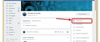
This element is the largest and most expressive in the entire page design. But keep in mind that when you add it, the avatar is removed from the page header. To upload a splash image, go to "Manage".
And next to the “Community Cover” inscription, click on the “Add” inscription.
In the window that opens, we are offered 2 options: make a regular or “live” cover. The last option assumes that you upload up to 5 photos and videos, which will replace each other at the top of the public page. I added a regular picture.
After that, close the window and refresh the page. Here's what I got.
Let's check what the picture looks like on a mobile phone.
If everything suits you, we move on. To make your cover more vibrant and useful to the community rather than just looking pretty on the page, you can add:
- a call to subscribe with a bright inscription or arrow,
- announcement of an important event,
- number of satisfied customers,
- company motto
- other relevant information.
You can also place videos, polls, and statistics in dynamic headers.
Who is the job suitable for?
Maintaining a group on social networks does not take much time, so it can be combined with your main job, study, and even maternity leave.
This type of activity is suitable for creative and active people who strive to learn new things, self-improvement and financial freedom.
The opportunity to work remotely, promoting a public page on social networks, is a good earning option for people with disabilities and residents of small communities where there is a shortage of vacancies, as well as for those who like to work at home rather than in a noisy and stuffy office.
You will be interested in reading Where to look for interesting content for running groups on VKontakte
Information
The description will help visitors understand what useful and interesting things they will get if they subscribe or join the group. Also in this section there is often a link to the website - the main web resource of the company or organization. If you did not add it immediately when creating the group, do it now in the “Management” section.
To add information about a community, simply click on the corresponding inscription on the main page.
This block does not have the ability to format the text beautifully, but you can add additional useful links and hashtags to increase the relevance of the page in search. When the text is ready, click on the “bird” in the upper right corner.
To get an ideal description of the group in VK, let’s add a few chips
- A short but succinct text that does not go beyond the words “Show in full.”
- The text is long, but structured, divided into blocks and up to the words “Show in full” all the benefits of joining the group are read.
- The description is written in a conversational manner and is not overloaded with emoticons.
- The text contains words or phrases by which, as we can assume, interested visitors will be able to find our offer in the Yandex or Google search engines. Such words are called keywords.
In one of the following articles, read detailed instructions on finding keywords that should be inserted into the description for the group.
© Anna Karelina
Pinned post
Designing a group correctly means making sure that visitors immediately understand that here they will receive interesting and necessary information. To do this, choose bright and useful material with an attractive headline and pin it at the very top of the news feed.
To pin a post, after publishing, hover over the menu icon in the right corner and select the desired action.
A post at the top of the page can replace the description of the community. It can be beautifully designed, place a navigation menu or useful links, and write down the group rules. The picture can be a continuation or addition to the avatar if a cover is not used. See how it looks in the sample.
Another way to grab the attention of visitors is to pin your video. When a user enters a community, this video automatically starts playing, but in order not to be too intrusive, it scrolls without sound. If a person is interested, he will adjust the volume himself. You can create short videos using the Supa video maker.
What else can be added to the community header:
- the most popular post that has already received a lot of likes and comments;
- announcement of an important event;
- message about discounts and promotions;
- practical jokes;
- surveys;
- customer reviews.
As well as any information that will help keep the attention of visitors and convince them to take action on the group page: subscribe, follow links, leave a request, like, share a post.
Who is an editor in a VKontakte group?
The editor is the third person in the VK group after the creator and administrator. He works in tandem with other specialists, ensuring the public has high traffic and normal functioning. The editor is appointed from among the group members by the owner or admin.
The main responsibility of such a specialist is the preparation and publication of content, but in many communities his work does not end there. Being one of the leaders of the group, he keeps order in it, adds and removes members, communicates with them on behalf of the administration, etc.
The editor needs to remember that user activity, a large number of likes and reposts have a positive impact on the development of the group. To achieve this, he must constantly maintain the interest of the target audience, come up with surveys, competitions and sweepstakes, add content that will attract participants, force them to discuss what they read or saw in the comments.
Tips for choosing and designing images
To make the image in the publication look beautiful and attract attention, it is best to make it a maximum size of 510x510 px. Then it will look good and stand out in the news feed on PCs and smartphones. It is better not to use a width less than 510 px.
A little trick: to make the quality of the pictures as good as possible, take a size 2 times larger than possible while maintaining the proportions. For example, you need to upload a photo 510x510 px, which means we take a photo of 1,020x1,020 px in size.
Picture with text
If you use a built-in editor to design a post, then it is best to take a dark picture and print white text on it. This way the message stands out and is readable.
If the text is typed on a plain background, then the optimal solution is to do the opposite - the background is light, preferably white, and the text is bright or dark. There are other techniques for highlighting text in an image:
- add effects: glow, stroke;
- do formatting: background color under the text, underlining, bold and italics;
- divide the picture into 2 parts and write an inscription on one of them;
- blur photo;
- choose photos that have free space for a text message. Look at the example in the photo.
Useful services
High-quality photographs are needed to make entries. You can find them on the following resources:
- unsplash.com
- rgbstock.com
- bigfoto.com
- picjumbo.com
- freemediagoo.com
- everystockphoto.com
- www.wylio.com
- pixabay.com
- dreamstime.com
- canweimage.com
- littlevisuals.co,
- freerangestock.com
- gratisography.com
- imcreator.com
- imagefree.com.
For additional image processing, it is advisable to have designer skills, but there are services that will help if you are new to this business. Good resources are fotor.com and canva.com.
Skills
The skills that an editor must have depend on the responsibilities assigned to him, so they differ in different groups. But there are requirements that any specialist must meet:
- ability to work with information, create and edit content;
- knowledge of techniques that help attract new users to the community;
- skills in creating and designing a group from scratch, using Wiki markup;
- knowledge of Photoshop and other programs necessary to promote a group on social networks.
You might be interested in reading: The cost of writing ready-made posts for Instagram
The editor must be able to work with information.
A specialist holding this position must have high communication skills, since he has to communicate not only with subscribers, but also with advertisers, administrators of other communities, copywriters, etc. He will have to establish a close relationship with each category of people.
Other design elements
We have looked at the main blocks that need to be worked out when you launch your VKontakte community. If some elements are not displayed on your page, go to “Management”, “Sections” and configure the display of the necessary items.
We can probably talk endlessly about page design. But I value your time, so I'll just briefly list some more elements that you can add to your group:
- personal greeting,
- discussions,
- wiki pages,
- navigation menu,
- links,
- tests,
- subscribe to the newsletter,
- documentation.
Go to the “Management”, “Applications” section. Here you will find many widgets and useful add-ons for communities.
How to write a description of a VKontakte community
Everything is simple here. Under the VKontakte community avatar, click on the button with an ellipsis.
An action window will open in front of you. Click on the “Manage Community” button.
Immediately below the name of your page is the “Community Description” field, which you should fill out.
Well, now let's talk about what should be written in the community description.
