The goal of the creator of a group on social media. networks to attract more visitors. It is important that the guest wants to join, sign, read information, leave a comment or order a product. The need for the final result differs from the direction of activity.
The first seconds of the stay shape the guest’s further actions. This is why the interface plays a big role.
Factors that leave a guest:
- avatar;
- description;
- Name;
- beautiful and practical menu;
- colorfulness;
- content.
It’s easy to create a practical menu that motivates more than just action. But first you need to figure out what it should be.
Construction topics
What is important:
– show options for apartments and houses, their advantages;
– inspire confidence in the developer and company.
Here is an example of a construction menu design. Using it you can view not only apartment options, but also individual residential complexes.
When you click on the “Choose an apartment” icon, you will be taken to the Marquiz quiz constructor.
You collect a customer base, and visitors to your group enjoy the convenience of choice.
The “Select Apartment” window leads to the group’s decorated products, where you can immediately see the layouts.
Another example of menu design for a construction company:
Click on “Reviews” and go to the “Video” section. This is a great way to build trust in the company, since we can look at customer reviews rather than read them.
A company manufacturing metal structures (fences, gates, stairs) also chose the Marquiz quiz constructor to calculate the cost of the structure.
And for easy navigation through the group, the company uses hashtags. Click on “Portfolio” and you will be taken to a page with all posts in this category.
Interesting design from the construction site.
If you would like to read useful articles about repairs, please do so.
Would you like a test?
What can I say, the guys tried their best.
How to create a menu in a VKontakte group wiki markup
Wiki markup is a special language used to design web pages in social network groups.
This tool allows you to create:
- effects;
- unusual menus;
- signs;
- navigation elements;
- format text.
In a word, this markup allows you to create a mini VKontakte website. This is very convenient, especially for sales and recruiting subscribers.
This design intuitively forces the visitor to stay and click on the button. That is, it delays and stimulates action - and this is exactly what is needed.
Visually, such a system is very similar to HTML layout. But it does not require long training and a special mindset.
Video: menu with search by category
Nuances of creation
Actually, what was done above (dividing and loading the image) are already markup elements. This is the advantage of this tool. Automatic transformation into tags when simply loading images.
However, it is important to know the individual tags to help add even more functionality and beauty. For example, when we fill individual parts of the image, white stripes may form between them. You can remove them by simply adding the noborder tag.
Like this: [[photo37602118_351733570|400x90px;noborder| link]]
The main tags are presented in the table below:
Working with pictures
In order to attach a link or text to an image, with the ability to slightly modify it, you should enter the following code:
[[photo37602118_351733570|options|text/link]]
.
Where options is replaced with:
- noborder
— removes the frame around the image; - nopadding
- removing spaces between the image; - plain
— insert a link to an image. Designed as text, without graphics; - nolink
— removes a link to the image; - box
— opens an image in a window; - NNNxYYYpx or NNNpx - sets the photo size in pixels.
Creating a table
Regardless of what kind of menu (text or graphic) you create, you are unlikely to do without inserting a table. Otherwise, you can just paste the text into the news field and not format it, wasting so much time.
A table is created using a special set of characters, where each of them is responsible for a specific part of the table:
- {|
symbol of the beginning of the table, without it there cannot be a table. Always used; - |+
is responsible for positioning the table title in the center. Placed after the characters at the beginning of the table. Use as desired; - |
denotes the beginning of a new line and cell; - |
a character that makes the cell transparent; - !
makes the cell darker. If it is absent, the previous sign must be used; - |}
means the end of the table. The optional character, however, is used to prevent an error from occurring.
When filling out a table, the contents of each cell must be placed after the | sign, and when separating cells, you need to duplicate the row types like this: || or !!.
Markup features
There are many unwritten rules, and this causes a lot of trouble for novice programmers. As a rule, everything is learned through practice. Everyone finds their own loopholes, everyone faces their own difficulties.
In order to avoid basic mistakes, you should familiarize yourself with the main ones:
- you need to be careful when resizing the picture - if it is less than 131 pixels, its quality will deteriorate significantly;
- The width of the image should not exceed 610px;
- It is prohibited to place more than 17 unclosed tags on one wiki page;
- when changing the width of the image, its height changes automatically and proportionally;
- a list inside a table should be created using the tag ;
- There should be no more than 8 list elements in one line of markup.
To create beautiful and functional navigation, you need to know the basics of Photoshop and wiki markup. However, the latter contains its own nuances, which, when faced with by a beginner, can get stuck and confused for a long time.
Important! Check that all tags are closed. Keep it consistent.
The main assistant in this matter is attentiveness and strict adherence to instructions. The official VK page, which is called wiki markup, can always help.
Catering (cafes, restaurants)
What is important:
– show the atmosphere of the establishment;
– talk about the menu;
– announce promotions and discounts;
– share the mood and feedback of visitors.
The SUN Project chain of restaurants and cafes offers not only a wide range of drinks and dishes, but also show programs.
The menu is bright and sunny. It combines two formats at once: the old and new menu.
Click on “Menu” and select a restaurant:
And here we have all the necessary information:
SUN Project also motivates you to leave feedback in the form of a “Questionnaire”:
A network of city cafes called “Samurai” immediately attracts attention with its bright red color:
The “Samurai” menu is located in the album:
Cafe Rosemary took a different approach. They decided to abandon covers with icons. The focus was on live, juicy photos.
Click on “Wine Map” and the pdf file opens in the browser. We're not sure if it's convenient from a phone, but from a computer it's more than convenient.
We create in stages
Creating navigation is an interesting, complex and lengthy process. But the result is worth it .
The whole process is divided into 2 stages:
- working with photoshop;
- technical addition.
video: menu for public
Working with Photoshop
Before you begin, you need to visualize the design or overall appearance, as well as its components. No special knowledge is required, just follow the steps of the instructions.
Algorithm of actions:
- install and launch the Photoshop program;
- in the “File” item, select “Create”;
- in the window that appears, set:
- width – 630 px;
- height – 725 px;
- background content is white.
Next you need to divide the work area into 2 windows. They will attract the attention of visitors and will definitely force them to move around the group.
This is done using the Rectangular Marquee tool:
- right-click on the icon;
- select the Rectangle tool;
- using the vertical and horizontal rulers as a guide, select a rectangle measuring 200x710 px by holding down the left mouse button;
Attention! Make sure the ruler measures in pixels and not other units.
- after, click the Delete button;
- in the window that appears, set the use of 50% gray;
- click OK;
- similarly create a rectangle measuring 382x442 pixels, as in the figure:
Working with graphics:
- Place your design below this layer:
- then write the desired text;
- Using the shape drawing tools, draw the buttons:
It should look something like this:
Save the rectangle located on the right as a separate image, setting the size to 200x500 pixels. This is a ready-made avatar, uploaded through the “Upload photo” button in the VK group.
The second picture still needs to be divided by the number of points. This is done in order to assign a link to each button.
First you need to make the markup:
- use the key combination “CTR+R” to turn on the ruler;
- move the cursor to the top ruler;
- holding down the left mouse button, drag down to the bottom border of the button;
- repeat for each button.
Create fragments:
- take the Slice Tool;
- at the top there is a button “Fragments by guides”;
- it should look like this:
Saving images:
- click File – Save for web;
- Enter the title;
- specify the JPEG format;
- set the best quality;
- check the boxes for “Progressive and Built-in profile”;
- The last button is “Save”.
How to clean your computer from unnecessary programs? Instructions here.
Next, proceed to the technical part. You need to upload the created masterpieces to the group.
Technical part
Finished images must be transferred to the group. By following the steps below, this task can be easily completed.
Important! Uploading a menu differs from usually uploading photos or pictures.
Everything in order:
- go to the group;
- turn on the news feed;
- next to the “Latest News” bar, click “Edit”;
- change the name to a menu or something similar;
- add pictures using a button in the form of a camera;
- the result will be something like this:
Now the most important thing is why all this was done. Add menu functionality. A separate image must be assigned its own link.
By clicking on the link, the visitor will quickly get to the necessary information.
If you want to insert a link to a post from the wall:
- find the required entry;
- left-click on it;
- copy the URL in the address bar.
To insert a link to another site, group, one-page site, etc.:
- go to the source where you need to transfer the visitor;
- copy the required address.
Next, simply paste the link to the corresponding image. Here is the image code that appeared in the image loading window: [[photo37602118_351733570|400x90px;noborder|]] .
After the "|" symbol just paste your link. It will look like this: [[photo37602118_351733570|400x90px;noborder| link]]
Save the changes using the corresponding button at the bottom of the window.
Attention! Changes may not be reflected immediately. It is recommended to log out to your main profile and then log back into the group.
Beauty salons, hairdressers
What is important:
– demonstrate the range of services;
– show the quality of service;
– give the opportunity to register online;
– show the atmosphere of the salon.
The menu of the Versace beauty salon looks simple and neat.
An interesting detail: you can see the interior of the cabin. After all, many people visit such establishments not only because of the quality of services. Going to a beauty salon is also an increase in your self-esteem.
Men's barbershop Cutlers uses darkened live photos for its menu.
Registration to the master is carried out through the YCLIENTS application:
The hair salon chain Haircut by Haircut uses icons on a bright orange background with a gradient.
The “Examples of Work” icon leads to community albums, where all services are collected by category:
The men's hairdressing salon "USA" made large inscriptions with images:
They gather their audience using the Senler mailing service:
Car services, car washes
What is important:
– show the range of services;
– convince the client of the quality of the service.
The SPBGARAZH car service also uses icons:
An interesting “trick”: when you click on “Ask a question” we immediately get into a dialogue:
Autotech chooses a muted red color with large icons:
“Trick”: in the menu there is a “Parts Finder” (that’s the name of the application itself):
The application allows you to place a request for the necessary spare parts, view stores with them or see disassembled cars.
The MasloMarket auto store made the icons themed:
You can sign up for a CTO through the YCLIENTS application:
And in this group we see a division into categories of spare parts. We immediately select what interests us and find out all the information.
Creative studios
What is important:
– show a variety of activities;
– remove objections (“it won’t work”, “I have no experience”, etc.);
– demonstrate the atmosphere in the studio.
Pottery studio No. 1 from St. Petersburg uses the same background for menu covers and places icons on top.
When you click on “Master Classes” we get to the products:
Studio "Kolibri" uses only live photos:
The “You are with us” tab is a transition to the group’s albums with all types of classes and studio master classes.
The creativity studio “Made with Soul” offers to sign up for free master classes right in the menu:
To do this, he uses a special service for children:
Decoration, design, decoration services
What is important:
– show beauty, aesthetics, taste, an unusual view of things;
– demonstrate the assortment;
– make ordering online convenient.
The Ga-den company produces interior maps of the world and countries. Hence this menu:
When you click on the “About Us” icon, a longread opens (VKontakte article), where the company introduces its team:
DECORANTOS specializes in wedding decorations. The menu is designed in soft pastel colors:
A young couple who is looking for a wedding decor studio can immediately fill out an application for wedding decoration in a group. Very comfortably.
PR advertising is a client of our agency. Engaged in outdoor advertising placement in Ivanovo.
We just recently designed this menu. We decided to divide all the content into categories using navigation hashtags.
By clicking on a category, the reader can read its latest news:
The convenience of this navigation is that all posts are automatically placed into categories. There is no need to update the menu category every time to keep the information in it up to date.
Order registration from a specialist
Why create a menu in the VKontakte group? Whether it’s a sales page or an informational public page, after some time it becomes almost impossible to find the desired post in it. Especially if you follow promotion tips and make 2-3 posts a day. To make it more convenient for users to find information of interest, there is a menu. Its presence significantly increases the effectiveness of the group, the number of views and, as a result, sales.
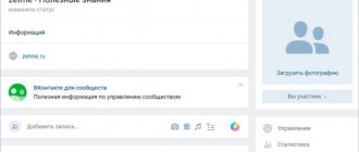
Externally, the VKontakte group navigation looks like large buttons located in the most visible place. They are displayed both in the browser version of the social network and in the mobile version. Users who visit the page will subconsciously want to click on attractive pictures with captions.
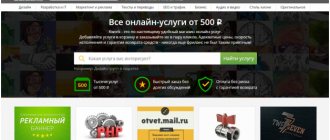
If you don’t have the time to create a VKontakte group menu yourself, it’s quite possible to hire a specialist to do the work. Fortunately, finding a designer is not a problem now. Contact any freelance exchange, for example KWork, and study reviews about the contractor and the cost of his services. If everything suits you, specify your wishes and pay an advance.
It seems that everything is simple and without any tricks. But this method has significant disadvantages. In particular, the high price of the designer’s services and the risk of getting the end result that is not what you want. There may also be errors that will disrupt navigation in the group. Although they will be easy to solve.
It seems to us that with the introduction of a new menu creation system, turning to the services of a designer will be justified in the case of creating a unified page style. For example, many Internet businessmen simultaneously order the design of their own YouTube channel, groups on other social networks, or a website. This creates a single, recognizable style. But if you don’t set such a task for yourself, you can easily navigate the group without outside help.
Marketing communities, online agencies
What is important:
– show that you are coolly packaged and are ready to offer yours;
– demonstrate your expertise (with the help of cases, useful articles).
TargetHunter, a service for analyzing and automating the search for target audiences for targeted advertising on VKontakte, uses a noble dark blue color:
The “Support” section leads to another community where users can ask questions on the topic and get feedback. Thus, the service collects its target audience.
More recently, Spark also appeared with icons that lead to their Instagram and Telegram.
In our VKontakte group, we share useful materials for developers, online stores, B2B companies, and owners who provide services to the public.
The materials were divided into categories and placed on the menu. This way, the target audience immediately sees that this group can be useful to them.
When you click on the desired section, you will be taken to a longread (VKontakte article), where you can see various
Limiting community content
Before you start drawing anything, it's important to think about how you want your menu to connect with the customer. It is worth deciding on the main goal of the group. There are informational, entertaining and selling communities.
- Information groups store tons of information on a specific topic. In such groups, the content itself is very important, because it is thanks to various interesting facts and educational articles that a person will not want to leave such a community.
- Entertainment groups are similar to information groups, the only difference is in the content. If you plan to create groups of these types, then it is worth creating a menu that will display the main topics (most importantly, latest publications, etc.). Read more about creating entertainment content on our blog.
- If the goal of the page is to sell, then you need to create conditions for customers to easily find products. It is best to place sections in the selling menu that will direct the visitor to the catalog (contacts, company, delivery). You need to create a contact page, thoroughly develop a system with reviews, and set up a bot that will answer customer questions.
The necessary components for running a successful group: an avatar, a banner for the menu and knowledge of how wiki markup works. It’s not difficult to make an avatar, you just need to tinker a little with the sizes and filters, and the rest is a matter of taste, because each person visualizes their business differently. Remember: your group is your expression, so try to do everything yourself or trust trusted specialists. Read our blog on how to properly design other aspects of a VKontakte group and increase conversions.

