How to beautifully design a VK page using photographs
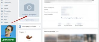
An avatar is the first thing a visitor to a VKontakte page pays attention to. A photograph is the face of a profile. Even if it is designed with the highest quality possible, but without photographs, such a page will not attract attention.
Do not use a picture as an avatar, but put a good quality personal photo.
It is best to save cats or other cute animals for the desktop. Use the services of a professional photographer and post some good shots. If you don’t have money for the service, you can use the front camera for selfies.
Selfies must also be of good quality. It happens that a person successfully appears in the photo, but the background leaves much to be desired. It is better to refuse such a photo, especially as an avatar.
Take this seriously. Change your main photo at least once every six months and be active. An avatar creates a mood and attracts new users.
The uploaded photos should reflect your personality, interests and life position.
As an avatar, choose a photo where you are not uptight, but confident. The photo should convey only positive emotions.
Do not post photos with alcohol, cigarettes, or in a club - this repels visitors and speaks about the lifestyle of the account owner.
It is advisable to create thematic photo albums. Combine photos in albums with each other to create a beautiful visualization. Arrange your photos according to color scheme, this will set the style of your account.
By clicking the cross in the “My Photos” block, you can hide inappropriate photos without deleting them.
Everyone enjoys looking at edited and beautiful photographs. On the Internet you can find a bunch of useful photo editors. Use popular mobile applications, they will help you make your photo unique.
Craftsmen are better off using the professional Photoshop program. Don’t neglect the opportunity to beautifully present yourself and your interests to the public.
For business
VKontakte is a huge platform for promoting business and advertising goods and services. In this case, the page design should be minimal.
Let's start with your profile and information about yourself. Be sure to write your full first and last name. Petrova Alexandra sounds more serious than Petrova Sashka/Sashulik/Shurochka. Even if you are remembered from student days as Sanya Baraban, it is better to leave your FI according to your passport.
When filling out information about yourself, always provide reliable information, because you are attracting potential investors and clients, and who will trust a 125-year-old girl from Zimbabwe or a billionaire from China?
Pay special attention to the photo, because this is the first thing visitors to your page look at. If you want to show that you are a serious, business person, then the photograph should be appropriate. It is best to order a professional photo shoot, no photos from a stormy vacation, the beach, especially in nude style!
Your face and appearance are your personal brand, and you need to establish yourself right away.
Let's go further through the photos: carefully look through the albums and delete all compromising photos. Your clients don’t need to know how actively you relax with friends, in what setting your home gatherings take place, to whom you show prohibited gestures, and how you beat the effigy of your first boss. Do the same with the photos in which you were tagged. If you cover your tracks, then everywhere.
Also pay attention to your posts. No references to games, because you are a business person, and no one should know when you harvest. Look at what they throw on your wall, and be sure to look at the statuses: no vanilla stuff, everything should be official and business-like, quotes from successful people are ideal. And now we can talk about a couple of tricks that will hook the client.
Secret No. 1 : the logo of your company/product (product, website, etc.) should be in your photo. It can be small and located somewhere in the corner.
Secret No. 2 : if you are promoting your product, then naturally you should remind about it, that’s why there are posts on the wall. But don't post too often, once a day or two during prime time will do just fine. Otherwise, there will be a boomerang effect and your friends will start to hate you.
A natural extension of your personal brand as a businessman on VK will be a group dedicated to your business.
A questionnaire as a way to make your profile attractive
By filling out the questionnaire in detail, you will not only be able to make profitable or friendly acquaintances, but also decorate your profile.
It is worth being sincere, but not boring the visitor with too long a canvas. So before you describe your favorite movie or book, focus on what will really enhance your profile.
In the “Basic” section you can enter the following data:
- Name;
- floor;
- age;
- Family status.
Other items are optional. However, filling them out can also affect perception.
In the basic information, it is better to indicate only your own initials, date of birth and age, so as not to overload the page.
Instead of a website, you can synchronize other social networks (Instagram, Twitter, Youtube channel) so that guests can get to know you better as a person. Be sure to indicate whether you have any education or courses. This is an important moment for reputation.
You can design your page beautifully using the following subsections:
- interests;
- quotes;
- About Me.
Here you can give free rein to your emotions. The “About Me” section is an excellent self-presentation. To avoid boredom, accompany the text with symbols and emoticons. In quotes, write the statement of your favorite philosopher, thereby creating mystery. Or include your own statements and broadcast them to the audience.
Since the “Interests” section is clickable, you can use it to find like-minded people, so you shouldn’t refuse to fill out the section. When indicating your place of work, be sure to add a link to a group or website, if one exists.
The guy does not have to fill out the “Military Service” section. This does not affect the beauty of the profile in any way, so you can fill it out as you wish or not indicate your military unit. “Life position” is also not required to be filled out.
Features of the mobile version and the VKontakte application
These versions have the same basic blocks as the desktop version, but there are also a number of important differences.
mobile version
In browsers on mobile devices, on the first screen the user sees:
- page title;
- status;
- page cover;
- “Message” button, action button and “Subscribe” button;
- block with goods (if connected);
- block with basic information if products are not connected.
The remaining blocks follow.
VKontakte application
Since the number of smartphone users increases every year, VKontakte is constantly improving the functions of the application and adding new ones.
The application also contains all the main blocks, but the first screen displays:
- community name;
- cover (there may be two options, more on that below);
- status;
- Message button and action button;
- geolocation;
- Website address;
- contact number;
- detailed information.
Let's look at everything in more detail.
An important difference is the “Live Cover” - this format is only available in the application and is not displayed on other platforms. It takes up up to two-thirds of the smartphone screen, allowing you to make the page more visible to a new audience and retain the user’s attention. It can contain current offers and promotions, information about products and new products, or a promotional video about the brand - everything that a business needs to tell the audience about itself.
VKontakte allows you to upload up to five videos up to 30 seconds long or photos in 1080 × 1920 resolution, which will switch automatically. It looks like this:
To enable “Live Cover”, go to “Manage” Community Cover in Settings.
Upload photos or videos of suitable size. There are two display options available for photos: in motion and without. To select a motion effect, check the box next to “Show photos in motion.”
After returning to the main settings menu, click “Save”.
Regardless of whether there is a “Live Cover” on the page, the user’s first screen displays the community name, status, “Message” button and action button, geolocation, website address, contact phone number and detailed information.
On the first screen, the map is not displayed in full - only the address is entered. The map itself is available below. The “Detailed information” block is also modified - it is collapsed, and you can read the description only by tapping on it.
A wall in the form of a mini-blog as a method of communicating with the audience
If your wall is empty, or is filled with centuries of invitations from friends to applications or games, then you need to sound the alarm and immediately correct the situation. Friends see a new post in their feed, which is a good chance to attract the public.
Think about what you want to tell your audience. You might be interested in sharing your opinion about a movie or some situation. There will definitely be interested people with whom a dialogue will begin.
A business account wall is a winning place to sell things or offer services.
Not only informational content will help decorate a wall. A photo with a post is an integral part of a beautiful profile.
Share your thoughts, new photos with posts, and your profile will attract more and more visitors. Write naturally, do not copy others, adhere to the interests of the target audience.
Status and number of friends as a method of attracting attention
The status can set the mood of the page and intrigue the guest. Here you can show creativity and imagination.
You can put a smiley instead of the status. It is not only beautiful, but also informative. Sometimes there are not enough words to express your current mood, and an emoticon will help you convey your feelings and share them with people.
In place of the status, insert your favorite quote from a book, line from a song or movie. You can share a joke or mood.
The main thing is not to overdo it with mystery (this is especially true for a girl), for example: “I am difficult to find and easy to lose.” It will look at least stupid.
Not many people know that in addition to regular languages, you can download interesting language packs. With their help you can decorate your profile and make it individual.
Social networks are created for communication. Add as many friends and acquaintances as possible.
This will not only revive your profile, but will also affect your popularity. There is a lot of benefit in a large list, even if people are unfamiliar with it.
If one of your friends liked your post (photo, post, etc.), then VK shows this post to the person’s friends as an interesting post. Be sure to expand your audience.
You can add 30 people per day, so it is possible to recruit several thousand people in a few months. Add only interesting personalities. It is not so much quantity that is important, but quality. Keep as friends only active users who will give feedback.
Groups, friends, video, audio - the basis for beautiful profile content
High-quality filling and proper material ratio decorate any profile. Avoid excess or shortage of any material, maintain a balance:
- Interesting pages. A large number of interesting pages not only clutter the feed, but also spoil the appearance. This is of no use. It’s better to leave a few really important pages that you visit most often. It is better to bookmark communities like “MDK”.
- Video recordings. A personal page can contain any video files. The work page is about the interests of your audience. If the public is not interested in crocheting, then it is better to remove such a video from Saved. I often see how successful business accounts contain old videos, which greatly spoils the external picture.
- Audio recordings. The privacy of the playlist depends on your taste. If you are a fan of specific music, then it is better to hide audio recordings from prying eyes and ears.
Carefully select video or audio information for publication, because this directly affects the attractiveness of the page.
You can change your VKontakte page not only using the design, but also the theme. To do this you need the Get Styles program. Any beginner can understand it.
Download the free program and install it. Then go to the program’s website and download the theme you like. The standard option can be returned at any time. The page gets a bright design and a beautiful cover.
Registration process
The easiest way to create a new account looks like this:
- go to the menu by clicking on the avatar in the upper right corner of the window and select “Exit”;
- on the login page you will see an instant registration form;
- fill out the fields and click on the “Continue registration” button;
- in the window that opens, you need to indicate your mobile number and click on the inscription “Get code”;
- receive an SMS and enter the code in the field provided for this;
- All you have to do is come up with a strong password.
That's all. Immediately after this, you can begin setting up and designing the page.
Moderate confidentiality is the key to the attractiveness of the page
Confidentiality is an individual matter. However, people are attracted to openness. Correctly set privacy settings will get rid of ill-wishers and annoying messages. If the question concerns a business account, then it is not necessary to reveal all your cards.
A personal profile requires maximum sincerity. Don’t forget about “Photos of me”, they are not always successful and it is better to hide them from prying eyes. Do not upload old photos to the album, do not spam with unnecessary information.
Don't talk too much about yourself. The laconicism and aesthetics of the page arouse great interest among the public.
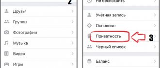
The most important thing is not to forget to finally evaluate your page from the perspective of a third-party user, using the privacy settings. This can be done not only using a computer, but also via a telephone.
This approach will make it possible to design your profile beautifully and make it relevant to other users. It would be a good idea to visit the pages of competitors with popular accounts, analyze them and find out the points that attract people.
VKontakte is a huge social network with more than 460 million users. It’s not surprising that everyone asks the question: “How to beautifully design a page on VK.” This is especially interesting for people who use their account for work. The recommendations and tips I have given will help transform any boring profile and make it stand out from other accounts.
Sincerely, Daria Borisenko especially for the proudalenku.ru project


