Telegram channel Programmer and business. Every day there are interesting stories about how a programmer builds a business.
In July last year, the social network VKontakte acquired a new feature called “Action button in VK”. Now administrators of many groups have the opportunity to add it to their community page. Thus, they attract the attention of users and promote their business with its help. Now it is called the “Main Button” of the VKontakte community. In this article we will look at why it is needed at all and how to properly configure and install it.
How to set up an action button in a VKontakte group
The action button is a button for quick communication. Call, message, purchase or go to the site.
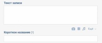
To set up an action button in VK, go to the settings of your community and scroll down. Opposite the line “Action button” - click enable.
Below, in the “Action Type” item, select one of the options:
- write by mail;
- make a phone call;
- call VK;
- open the website;
- open the community application;
- open the mobile application.
Select the desired item. For example, select “Open website”.
After this, you need to specify the site address and select the name of the button. On our button there is the inscription “More details”.
Depending on your choice, you may need to specify a phone number, administrator, email, website or mobile application address.
Guide to buttons with calls to action on VKontakte
Buttons with calls to action in VKontakte ads: your new weapon for high conversions
Are you placing an advertisement in the VKontakte news feed and want to know how to get more applications, calls and subscriptions for the same money? Or maybe this tool has not yet been used and you want to use it as effectively as possible at the start?
In our first post we will talk about the recent innovation of VKontakte. It allows advertisers to get much more value from placing paid ads in the news feed. This new tool is active buttons in ads or CTA buttons (call to action buttons).
Considering that today the only payment model for promoted posts on VK is uCPM (money is debited as per 1000 impressions), the new feature will help you get much more requests or calls with the same budget. According to representatives of the social network, even 3 times. Well, let’s take the word of VKontakte development director Alexander Kruglov, who bases his statement on internal tests of the social network.
So, what do “Buttons” do, what are they, and what tasks of your business will they help solve much faster?
Starting from November 16, active buttons can be added to promoted posts (in the news feed they are marked as “Advertising post”): “Buy”, “Go”, “Install”, “Join”. In addition, there are more than a dozen options. The choice depends on your cherished goal - to get referrals to an online store, direct a potential client to a dialogue with the community administrator, or even force them to dial your number directly from the VK mobile application. The buttons are displayed not only on the desktop, but also in the mobile version and in official VKontakte applications.
The biggest advantage of the innovation is your ability to force a potential client or subscriber to take the action you need quickly and without unnecessary steps: if you want sales, direct them directly to a product or service; if you want registrations for your seminar, write a link to the registration form; if you want more subscribers, invite users to join your community in one click. Don’t force the user to think, study your materials unnecessarily, reduce the time for making a decision and get much more leads: subscribers, calls, contact information or instant sales. It is important that the tool will help optimize the budget: we pay not for applications and clicks, but for ad impressions in the feed.
For your convenience, we have made this guide on VKontakte CTA buttons. Find out which buttons are best to choose based on the objectives of your advertising campaign and the conversion goals you want to achieve.
You can download this manual in PDF format from the link: checkboxes_cta_to_vk_pdf
What to pay attention to when setting up CTA buttons?
Now, after we have decided on the goals, types and texts of buttons, it’s time to move on to setting up a CPA campaign. It is worth noting that there are a number of nuances here, so we decided to tell you about them.
We won’t dwell on targeting settings and choosing bids; let’s move straight to working with the advertising record.
So:
- Go to the advertising account (section “Targeting”) and select the advertising type “Record in the community”. VKontakte will offer us to create a new post or select a ready-made one. However, you can only advertise the entry of the community whose administrator you are.
By the way, not many people know that you can promote posts on VKontakte without publishing them in the community (hidden advertising posts). They will only be seen by the target audience of the advertisement, and they will not be displayed on the community wall or in the news feeds of subscribers.
2. Let's say we already have a post that has proven itself well virally (that is, it received a good response from subscribers without advertising). Copy its link into the window and open it for editing.
3. Click on “Add link” (third icon under the advertising post) and enter a link that should be relevant to the target action we expect. In our case, this will be a transition to dialogue with the community. Save and move on to the next stage.
4. Here “VKontakte” will ask us to choose the text of the button: “Write”, “Contact”, “Join”, “More” or “Go”. It is important for us to invite the user to chat, so in our case we select “Write”.
5. Click “Save”. But that was not the case, VKontakte will ask us to remove all links from the ad text. There can be only one link - the one that will be written in the button.
6. Save. And again we fail: the text is too long. VKontakte allows us only 220 characters.
7. We mercilessly cut the post, leaving only the most important things. We try to save again without success - two line breaks are not allowed.
8. After the correction, we encounter another problem: we will have to discard the attached image. Instead, there is an option to insert an image for the link. Its dimensions should be 537x240 px - this is smaller than the usual image formats for posts.
9. Hurray! Finally, the ad complies with all the rules, and we can run it, anticipating a flood of messages to our operators.
Well, VKontakte turned out to be quite strict regarding the CTA advertising format.
We summarize the general requirements for advertising materials for this type of ad:
- There should be no links in the ad text itself.
- The maximum number of characters is 220 characters.
- More than two line breaks are not allowed in an ad.
- Attachments are prohibited. It is acceptable to add an image for the link with a size of 537×240 px.
And these, in our opinion, are essential technical requirements for all promoted VKontakte posts. On a note:
- You can only promote posts published on behalf of a community that you are an admin of.
- You cannot advertise recordings of closed or private groups or private events.
- Only one advertisement can be created per record in the system. Tricks of spreading identical ads across different advertising accounts won’t work either.
We wish you effective advertising campaigns and more quality leads!
And be sure to test “Buttons”.
Your Checkboxes
spark.ru
How to add a map with all company addresses
To add or change an address. Opposite the “Addresses” field, set “Enabled”. And put a tick in the “Show map” field so that a map with addresses is displayed in the group and you can see where you are.
Add the addresses where your offices or representative offices are located. Head office, when adding Fr.
When a user views a group, the list will display the address that is closest to the user right now. To add more than one address, in the same “Addresses” tab, click “Add address” below.
This is interesting: How to set up targeted advertising in VK
How to make a VKontakte clickable button on a YouTube video
Hello, friends! From this article you will learn how to make a VKontakte link to a YouTube video in the form of a clickable button. This button will send your news readers directly to your video channel. You can’t do it just like that, but by using the described method, you will do the impossible on VKontakte.
At the same time, we can say that the person will conditionally remain in your group at the same time. You may say: “Why have a button if you can just post the video on your wall or in a group?” Indeed, this can be done, but all the laurels from the videos watched will mainly be taken by the contact. But the button already 100% guarantees that the number and time of viewing will be counted using YouTube tools. This is an important fact considering that since the beginning of this year, in order to become a YouTube partner, you need to gain at least a thousand subscribers and 4,000 hours of viewing.
If we talk about the benefits of such a button directly for promoting VKontakte, it lies in the fact that you can provide a link to your video in a variety of variations.
As you can see, this is not a banal repetition of the same title image of your video in your news feed. In this case, there is a place to roam, dream up and ultimately achieve your goal.
With any other site except YouTube, it would be possible to make this button as written in this article of mine . By and large, the algorithm of actions has not changed at all, but Contact itself is rearing up in relation to YouTube videos and, as a result of seemingly logical actions, will still display the video in the form it usually does.
However, you can force the contact to change his attitude towards the YouTube link using an ordinary redirect. In this case, the redirect will act as an intermediary.
To create a clickable button, you can use at least four types of redirect. I will focus on the first one, as the simplest and most accessible for any Internet user. Why I chose the bitly.com link shortening service for this method will become clear to you if you read this article with the comparative characteristics of link shortening services.
The entire process of creating a VKontakte post with a clickable button can be depicted with this diagram:
In short, you take a link from your video, shorten it in a link shortening service and paste it into the VKontakte news adding window. VK will show you a video preview, where by clicking on the camera icon you can replace the displayed preview with a button image.
You can see how this is all done in practice in this video.
Subscribe to my video channel and watch other videos
You see, the process is not complicated. Links to all necessary services and additional videos are in the video description directly on my channel. The only thing that can cause difficulty is the process of creating the button itself. In fact, it can be done in any graphic editor, not only in Photoshop. Here's a template for you. Its dimensions are 537x240 pixels.
You can download the picture by right clicking the mouse
Your task is to fit the button on a white background.
There is no need to crop the image. Just make a button and then when you insert it, don’t adjust anything either. There will be no gray background after publication. Here you can download the button template in PSD format .
The template has three ready-made button options. You can easily correct them or turn off their display and do something of your own. If so, ask questions in the comments. The technique is the author's, so you will be pioneers in the placement of such tricky buttons. Now you have an excellent opportunity to promote your YouTube videos on VKontakte without boring your friends and guests with the same thumbnails of your video.
Best regards, Sergey Pochechuev
DID YOU LIKE THE ARTICLE? TELL YOUR FRIENDS!
prostodelaytak.ru
Schedule
You can specify the work schedule in VK for each branch separately. To do this, either when adding an address or after, open it in the settings and in the “Opening hours” field select “Open during specified hours.”
And for each day of the week we set the opening hours. Finally, click “Save”.
If you want to delete one of the addresses, then opposite it you need to click “Edit” and at the bottom of the window that appears, find and click “Delete”.
How to make a “subscribe” button on VKontakte?
Many VKontakte users are annoyed by constant friend requests from strangers. Alerts about them will be displayed until the person accepts or rejects the application. Few people know that the site developers offer a solution to this problem using a single option - the “Subscribe” button.
Why is it needed?
With the help of simple manipulations, the owner of a VK account can replace the “Add as a friend” button with “Subscribe”. It will be seen by unfamiliar visitors to your page. By clicking on it, you will receive a notification that the user has been added to your subscribers. In your free time, you can decide which of them to add as friends.
A person who subscribes to your page will have access to the information that you allow all VKontakte users to see in their privacy settings.
How to connect
For the button to start functioning, log in to your VK account and follow the instructions:
- On your account page, click the downward arrow next to your profile photo thumbnail;
- In the drop-down list, click on the “Settings” section;
- In the menu that opens, go to the “Privacy” tab;
- Open the “Contact me” block and allow notifications about incoming requests only from friends of your friends.
You can check whether the specified actions have taken effect as follows:
- In the settings, open the “privacy” section, click the “See how other users see the page” link;
- In the drop-down list at the top, select “Unfamiliar user”;
- If everything is done correctly, the button will appear instead of the “Add as a friend” icon under the profile photo.
And here you can see whether strangers see the basic information of your page, images and geotags, a list of communities, audio recordings, and a list of gifts.
If this information is open to all users, then changes will be available to people who are subscribers. For example, they will see a post about adding photos in their news feeds.
In Group
If you are a community administrator, you cannot install a “subscribe” button in it. Users will only be able to apply to join. But on the official pages - you can. Therefore, if you want to expand your audience in this way, simply change the group settings, making it an official page.
tvoyvk.ru
Share and Follow
Share and Follow is the coolest social bookmarking button plugin I've ever come across. There are a lot of possibilities and just as many settings. Installation and getting started is quite quick - download the plugin, activate it in Amdinka and indicate in the Share and Follow section which buttons you need. They will immediately appear on the blog pages.
After this, you can begin detailed settings - you can choose the size of the buttons, many different social services, as well as general features (RSS, email, print version). This same plugin adds a follow element to the side of the scroll bar and also has many other options. There are paid options, but there are enough free ones without them. I suggest watching a short video on using Share and Follow:
I may look at the Share and Follow module in more detail in the future, but you don't have to wait for me to explore it yourself. The most important thing is that it is ideal for both Runet and English-language sites - the list of social services is more than sufficient. Installation is quick and easy, in short, Share and Follow should be in the archives of any wordpress website/blog developer.
PS By the way, about social networks, you may find it useful to have statuses about life for VKontakte, which you can set up for yourself very simply. There are several basic psychological aspects in life, such as personal self-development, that allow you to achieve great success and results. You can slightly improve your vision without glasses by wearing contact lenses to work or school, order them online.
Did you like the post? Subscribe to blog updates via RSS, Email or Twitter!
27 votes , average score: 4.59 out of 7)
Categories: Plugins; Tags: VKontakte, social network buttons, plugin reviews, social networks, social functions.
