Hello everyone, dear readers of the AFlife.ru blog! Promoting the VKontakte community is a complex and time-consuming process. To achieve a good result, you need to fill the public with interesting content and format it correctly. The design of the community header is of great importance - a horizontal avatar located at the very top of the group page. After all, it is the user’s first glance that falls on it, and the header creates the main impression of the public. Therefore, the question of how to install a header in a VKontakte group worries many novice admins.
VKontakte cover for a group - what is it?
The VKontakte cover is the horizontal avatar at the top of the VKontakte group. The cover makes it possible to include more information for visitors. It is the group header, just like on the website, and immediately catches your eye when you enter the VK group.
The VKontakte cover is shown on mobile devices, which is a huge plus. When creating a cover, be careful, as the parts on the sides of the cover will not show on mobile phones.
Quality requirements
Before you make a header for an online VK group and install the finished version, it is worth studying the requirements set by the developers. These parameters will help you choose the best photo option that will fit perfectly on the group page:
- Minimum size – 795x200 pixels;
- Recommended size – 1590x400 pixels;
- Resolution – 72 pixels per inch;
- Possible formats are GIF, PNG, JPG.
Please note that in the mobile version the page content is compressed and may not be displayed correctly. To ensure that all important information is displayed in the required field, place the main part of the image in the range of 920x320 pixels.
VKontakte cover design for a group
To properly design a cover for a VK group, you only need to comply with a few important conditions.
- A headline that should be short and clear
- A subtitle that gives a brief explanation of what will be in this group
- Photo of the product you are advertising in this group
- Contact information (website address, phone number, address, email address, etc.)
- Call, where you tell the visitor what he needs to do (join the group)
Don't forget that brevity is the sister of talent. There should be a minimum amount of text on the cover so that it is convenient for a person to read and look at it.
Here is an example of such a cover:
How to properly make a header for a public page on VK
Our experience shows that people like surprises. Unexpected fantasy, unexpected advertising design - all this pushes a person towards pleasure. When a person sees an unusual play on words or an unusual combination of pictures in front of him, he begins to admire it, which means he automatically begins to RESPECT the idea of the creators, and, accordingly, the group itself and what they write in this group. Let us show you this trick. Perhaps you have already encountered this and were also surprised by it:
Cover combined with attached photo:
Fig 15. Original combination of a header and photo in a pinned post - EXAMPLE No. 1
Or like this:
Fig 15. Original combination of a header and photo in a pinned post - EXAMPLE No. 2
This design approach to group design amazingly attracts a new audience and forces new people to be active in the group. Because reposting posts to your wall is cool! We will tell you how to pin a post on the wall in one of the following articles.
Cover in trend style
Remember that the world is changing every day. What are trends? In simple terms, these are Uggs, then Louboutins, now tight trousers with an open ankle (fashion trend of 2021). Or, for example, the trend of smartphones, tablets, rather than regular mobile phones. Trends change very quickly, as progress does not stand still. If you use fashion trends in your band cover design, you will also lead people with you. For example:
Fig 17. Successful covers using fashion trends - popular cartoon, sports, mobile device, lifestyle, graphic effects
Negative cover
A cover can either interest a person or repel it. Therefore, do not make mistakes like creating spammy covers. What is a spam cover? This is a cover that urges you to join the group. Such requests have already set the teeth on edge of the average Internet user. The more people you ask to add, the fewer of them will stay with you.
Fig. 18. Don’t encourage people to join the group on the cover image—it’s off-putting.
Also, you should not use the cover to place a list of services, with phone numbers, website addresses. A person still won’t go to the site, typing the address into the search bar, and he won’t call the phone until he understands more deeply what you offer. On the Internet, such a presentation is similar to handing out a leaflet on the street, when they try to force it on you, to give it into your hands. But on the Internet it’s easy to get rejected - a person simply closes the group and never comes back, because the main purpose of the cover is to BE LIKED!
You need to attract people with virtual hospitality. It's like you're virtually allowing someone to come in and feel at home.
A little humor for the concept of Spirit
And if at the entrance you do not invite the person to undress, sit down, and start edifyingly asking him to buy something from you, then he will immediately turn around and leave. This is a common human reaction. This is the psychology of consumer behavior of goods, services and all kinds of small offers.
Figure 19. Example of a spammed cover. Phone numbers, call to join, website address - all in large font.
However, you can use addresses and phone numbers on the cover if they visually occupy no more than 10% of the entire image. When they fit organically into the design, they are visible, but do not draw all the attention to themselves. An example of an adequate cover:
Fig 20. An example of the most successful cover WITH TASTE. Phone number, address at the bottom of the cover under an organically designed brand.
By adhering to the above recommendations, you can not only make your group modern, but also surpass your competitors. When your group noticeably gains popularity, and, accordingly, a solvent audience, you will understand that it was not in vain that you read this article. Do you want to make money on VKontakte from a group or learn about other ways? Then read:
- TOP 10 ways to make money on VKontakte from groups
- How to make money on VKontakte
Creating a VKontakte cover
To create a VKontakte cover for a group, you don’t need a lot of intelligence or effort. If you don’t have time to create a cover, and you are ready to spend from 300 – 700 rubles on creating a cover, then welcome to the Work-zilla service, where specialists in this matter will make the cover you need in a fairly short time. They will make you beautiful covers for VK.
If you have a limited budget and you want to do it yourself, then you can use an excellent service for creating beautiful banners and covers - the Canva service. This is a very convenient and free service for creating various banners for different social networks and more.
Sign up for Canva
In this article I will not describe how to create a cover there, I will give you my video instructions for creating a VKontakte cover.
Watch the video instructions below:
How to make a VKontakte cover
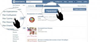
Now let's move on to the most important thing - adding a cover to the VKonakte group. In order to add a cover for a VK group, you need to go to the group itself and click on the button under the “ Manage ”
Next, go down a little lower and select “ Community Cover ” and select “ Add ”:
A page will appear in front of you where you will need to click on “ Add cover ” from your computer and select the cover you need. Next, click on the “ Open ” button:
After your cover has loaded, you click “ Save and Continue ”:
Next, a page will appear where VKontakte offers you to make a Live cover, which will change automatically, and it will look like an animated picture. If you are not going to make a Live Cover just yet, just click the cross at the top and close the window:
I will tell you how to create a Living Cover in the next article.
After you close the window, click the " Save " button in the settings and you can return to the group and check your cover.
Our VKontakte cover is ready:
Choosing a background for the cover of a VK group
The background screen of your public page should be as consistent as possible with its content and inspire confidence among visitors. Good results are shown by the author's photographs. Pictures of machines in production, cakes in your kitchen or satisfied clients in a hairdressing salon “come in” better than hackneyed pictures from Yandex search. If there are no such materials, you can use a free stock photo database, for example, Unsplash. The service offers a huge selection. But key queries must be entered in English. A good Russian-language stock is Pixabay. But the number of freely available files is limited.
However, you don’t have to be a designer to do everything yourself. You just need to know the basic rules and techniques.
Not only the text reveals the theme. A suitable illustration does this itself. It is enough to bring to the fore a key event, event or person.
In recognizable niches, you can adhere to a minimalist strategy. The brand comes first. An abundance of inscriptions, on the contrary, can ruin everything. A fan interested in the logo begins to study the details himself.
People are also attracted to feelings and emotions. A couple in love in the background creates a calm atmosphere, and the bright red font conveys the necessary information.
With the help of a community cover on VK, you can stimulate people to take a targeted action. A pointer to the menu encourages visitors to explore sections of the public. And if you make an intriguing signature nearby, they begin to look for a mysterious solution and linger with you.
An arrow pointing to the subscribe button helps users stay with you further. However, you should not limit yourself to just visual highlighting. Already at the first stage of getting to know the audience, you can interest them with a benefit or bonus. A nice gift, a promise to solve a problem, or a catchy phrase stimulates action.
In this case, not only direct, but also indirect levers of influence on the target audience are suitable. Marketers' research on eye trails has shown that we tend to look where others are looking. This can also be used to our advantage to focus on the elements we need. Despite the bright, expressive image of the characters, we concentrate on the text even without direct reference to it.
The latest VK innovations – dynamic covers for the group – help make the page interactive. The community header contains blocks that change over time. These can be neutral elements: clocks, exchange rates, weather in the region. But most of all, photos of friends and acquaintances attract attention. The built-in modules “most active”, “best commentator” or “last subscriber” show the avatar of the distinguished person in the header. However, there are many possibilities. We'll talk about them in a separate article.
Color solutions play an important role. A correctly selected range of colors attracts the target audience just as well as a catchy slogan. This is actively used by marketers. Orange and yellow tones are characteristic of cheerful people. Green is associated with health, sustainability and money. Blue – symbolizes calm and reliability. It is preferable for the male half of the participants. Shades of red perfectly attract attention. Indispensable for promotions and sales. Using more than three colors will unfocus the eye. It is better to use color resonance, shades and halftones.
A current picture for the cover of a group on VK helps you get into trends. An upcoming event always attracts attention. Announce relevant events even if you are focused on a broader topic.
How to change the cover of VKontakte
In order to change the cover of the community, move your mouse to the right corner of the cover and click on the button in the form of an upward arrow:
Now click on the “ Select file ” button and select a new cover on your computer and then click on “ Save and continue ”. After this, your VK cover will be added to your group.


