The essence
Creating a new one-page website will now take just a few minutes. Moreover, the community owner does not even have to understand the intricacies of website building or code, hire specialists or spend hours of time on it. It is enough to click on a few buttons for the site to appear on the Internet and become available to all users.
Now the products will be seen by all people who are looking for similar items on the Internet. You will no longer have to limit yourself only to VK users - the site will be visible to those who are not registered on VKontakte. The main condition is that the community is open, this is worth checking in advance.
To do this, you just need to go to group management:
Go to the “Community Management” menu
In the field that opens, look at the group type. It should say “open”.
Let's check what type of group it is. It can be public, closed and private
We have already talked in our article about how to create a small online store right in your VK group. We recommend reading about this too.
The site is optimized for promotion - clients will see a block with benefits, the most important information, a button with a target action to be performed, contacts, and the place where the service is provided. In short, now it becomes much easier to present your products.
Developers conceive sites so that they are indexed and appear in search results in the same way as communities on VK. There are no special opportunities for SEO yet, so getting to the top will most likely be quite difficult. But if the business is unusual, for example, designer jewelry or leather goods that have no analogues in the region, then it will be easy to get to the top.
Where do current photos come from?
The tool analyzes all the photos you have viewed - on friends’ pages, in public pages and groups (see how the types of pages differ in VK). It is based on photographs, which is formed on the basis of the number of likes and reposts (see also how to get likes on VK on an ava quickly and for free). As a result, we get a list of popular photos, which are displayed in the “Current photos” block.
With this tool, you can always see the best photos that have recently been published on pages that you find interesting and often visit.
Please note that the feed of current photos will be available if you have not visited your page in the last two hours (see how to hide the time of visit in contact). After viewing it, it is removed from the feed until a fresh list is generated.
What the site and link to it will look like
Before you start making a website, you should pay attention to the name of the community page on VK. The fact is that the site will have the same domain as the community. It will look like vk.link/, and after “/” the name of the group. For example, vk.link/black_butterfly.
If the group has a name like public543975 or club9483247, I advise you to first change this in the settings. It is worth creating a clear address that will be remembered and associated with the direction of the group.
The short link after creation will look like vk.link/community_name. It will open equally well on mobile devices and on PCs. It will also be possible to place a link to the site on any platform, unless prohibited by its rules.
How news about the social network “VKontakte” is presented on our website
The main disadvantage of a blog is that you can simply miss the latest news about changes in the functionality of the site itself. Especially if you have hundreds of friends, and you yourself are a subscriber to a large number of groups. It is in this case that you will be interested in our website, which contains maximum useful information without unnecessary garbage.
We present news about the social network “VKontakte” of the following types:
- Competitions. The company's management regularly holds various competitions with valuable prizes. Some of them are designed for ordinary social network users, while others are for experienced programmers. Who knows, maybe you will become a member of the VKontakte team if you don’t miss the news about the ongoing competition;
- Changes in design. We often overlook updates in this direction. But the developers are trying for our convenience. Therefore, it is worth appreciating their work;
- Applications for working with social networks. Since VKontakte appeared, developers have written a large number of applications to work, for example, on mobile devices. You can learn about them and evaluate their functionality using our website;
- Smileys and stickers. Ever since it became possible to add emoticons and stickers to messages, craftsmen have never ceased to amaze developers with their imagination. You can always find out about the best innovations in this direction on our website;
- Reporting vulnerabilities and errors. These messages will protect you from possible scammers.
These are just the main types of news presented on our website. Stay tuned so you don't miss important posts.
Making a website on VK: step by step
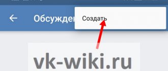
Go to community settings. Find the item “Site from a community”, click on “Create”. Almost everything in the community will automatically go to the site. Next, you will need to fill out the “title”, “description” and “action button” fields.
Where does website creation begin?
- Heading . You can come up with anything. One that will attract the attention of customers is perfect.
- Description . Tell us about what is offered on this site. Not very long. It’s better if it fits in 2-3 lines so that it fits organically and accurately conveys the essence.
- Cover . You can change and choose any one you like. It will show you how the title, description and button will be positioned. Convenient - you can select and immediately see how it looks for clients.
- Action button . You can choose from several options. Under the option there is a description of what will happen after the client clicks on the button. For example, when you press the “Write on VKontakte” button, the client will go to the community page and a dialogue will immediately open.
- Advantages . Here you can indicate one or more points in which the organization differs from its peers and competitors. You can add many options, they will click under the button. The font is small but readable. Attracts attention.
- Selection of goods . You can also choose whether only some of the products will be offered on the pages or all at once.
- Gallery . Placed under the selection. Here you can choose where photos for the gallery will be loaded from. This could be a specific album on VK or all possible photos from a community page. If you illustrate what the company has to offer, you will be more likely to buy.
- Reviews . This marks the place where real customer reviews of the products are located. You can choose a topic in which people write, but only if there is at least one review.
The benefits are written down and products are selected for the gallery.
Below these settings there are two buttons - “Save” and “Preview”. The first saves all changes and creates a site, and “Preview” opens a page with a demo version of the site. It's worth using it to see what the page will look like.
After saving, the site has its own address and “published” status. At any time, you can edit the site through a group in VK or hide it from public access for a while.
Below are the statistics. You can find out:
- how many users opened the page;
- how many users are unique;
- which users are active;
- how many people looked at the “contacts” tab;
- who moved into the community;
- how many people pressed the action button.
Convenient - you can always see the status of the site, there are statistics for different periods of time.
The background will be the image that the user chooses. But if he doesn’t yet have a suitable interesting photo that would reflect the essence of the business, a standard gradient will come in handy. Such a background will not distract buyers or confuse them.
This is what a gradient cover looks like
Standard event creation
To create a new event you need:
- Go to the groups page.
- Click on the “Create Community” button.
- Select “Event” from the options.
- Indicate the name, topic, type of meeting, date and time, organizer, address, etc.
- After filling out the form, check the details carefully.
- If the information is correct, confirm the creation.
- A new community will appear in which you will be the administrator.
What features are provided:
- Invite friends and members of your own groups.
- Adding posts to the wall.
- You can attach photos.
- Add contact details.
- Attach a link to the site.
- Add videos, etc.
Filling the site pages
To maximize conversion on the site, it is worth placing additional information on it - selections of products, useful articles, reviews from satisfied customers, many photographs of products and other information important for the buyer and decision-making.
To add all this, just check a few boxes. After this, the materials will be uploaded from the community to the site.
Let's take the example of a small community that makes custom bracelets and earrings. After creating a community-based site, the title and description will appear on the first screen - these are editable fields. There is also an action button. Here it is “write to VKontakte”, the method was chosen by the site owner.
A product from the community looks great against the background if it is beautifully photographed
The second screen displays the products and services that the business offers. In this case, these are earrings, bracelets, pendants, and sets. Below are catalogs of jewelry that is currently in stock.
Photos of products sold are selected in the “Product Selection” item
The third screen contains reviews. They are also automatically downloaded from the social network. All reviews are signed by real people, there is a date and time when they were left. In addition, you can open the VK page of the user who left this review. You can also click on the review and open it on VKontakte to view the full text.
You can click on reviews and find real buyers, this increases trust in the product
The last screen is contacts. On the left side is a map of the city where the establishment/workshop is located. It can be scaled if necessary.
On the right side are links and a specific physical address. It will come in handy if the client wants to go and personally pick up the goods from the workshop. In the links you can put any posts from the community or a link to the group itself of your choice. There you can place links with interesting posts or information that will help in choosing a product and push the client to purchase.
A real map of where the workshop is located, useful links that help the client make a choice
The launch of the free designer is commented on by SMM specialists and department heads. For example, this is how the head of the SMB department of the social network Daria Kostyuk comments on it:
“More than 2 million people develop their business on VKontakte. We continue to make the process easier and cheaper for those doing business online.”
Dmitry Kovalev, SMM and advertising specialist (Yandex.Money employee): “A convenient tool for micro-businesses - just right when there is no budget, team and time.”
Another specialist gave a detailed commentary on the news. This is what Sergey Evsyukov, leading SMM specialist at the creative agency RUPORT, says.
“At first glance, the appearance of a website builder is promising news. I got the finished landing page 3 minutes after I logged into the corresponding section in the admin menu from my smartphone.
But if we look at the innovation with partiality, then no revolution has occurred. In essence, administrators were simply asked to simply change the appearance of communities by hiding the social network interface. The very content of the future site will almost completely duplicate the content of the communities on the basis of which it is created. The social network did not provide any options for design, functionality or changing the layout - even the simplest ones like HTML or CSS.
I remembered the wiki menus that have been on VKontakte since the last decade. Many administrators turned news blocks using wiki markup into full-fledged information resources with easy navigation, a system of hyperlinks and individual design. It turns out that even in wiki pages there were much more opportunities for customization.
Perhaps VKontakte sites are suitable for small businesses that need a beautiful landing page and neither the issue of fine-tuning the landing page nor the issue of a domain name is important. Our agency works with large clients - we will not use this functionality for them.”
Statistics, orders
On the new site you can analyze the results of the page. Statistics are available on unique visitors, their actions and site viewing. Since the content can easily be changed in minutes, you can test different hypotheses and test advertising campaigns.
In the near future, VK promises to add design options and integrations with advertising tools.
Now you can start advertising your site and increasing its traffic. VKontakte already offers its own tools for this.
Sites from VK can also be advertised, the controls are intuitive
The creators believe that this tool will help marketers and entrepreneurs increase the volume of orders, as well as begin to attract customers much more actively. Of course, VKontakte did not stand aside - the domain vk.link/ indicates affiliation with VKontakte and dependence on it. But the network is actively fighting for advertisers with Facebook and Instagram. The idea of creating a site was liked by all aspiring entrepreneurs and those who were actively developing their groups in VK. Now they have even more reasons to do business through VKontakte.


